Thursday, June 26, 2008
Wednesday, March 26, 2008
Here are the final ideas for the name of the show:
Bicycle Built for Thesis
Rollin' With the Thesis Crew
I'm Ready to Party
Rollin' With Thesis '08
"I Thought of That While Riding My Bike" - Albert Einstein (As Main or Additional Text)
Ridin' Dirty: Thesis '08
Moving On
Cycles of Art
From what people have said it sounds like "Bicycle Built for Thesis" is the most popular idea, followed by Cycles of Art. If people have any other last minute ideas post 'em up! I think we should try to accomplish this whole naming task by Friday so that Lauren has enough time to add it in etc.
Also, when are people free for a Estabrook night and/or Dim Sum?
Wednesday, March 19, 2008
Show names, take two
Post some Wish You Were Thesis alternatives.
Ready? Go!
Here's my idea:
Thesis built for thirteen (it's like "bicycle built for two,"... get it?)
To get started, these are the general concepts that we can try to connect:
Art
Bikes
Tandem (and maybe the idea of working together, if that's not too cheesy)
Thesis
Quirkyness
Ready? Go!
Here's my idea:
Thesis built for thirteen (it's like "bicycle built for two,"... get it?)
To get started, these are the general concepts that we can try to connect:
Art
Bikes
Tandem (and maybe the idea of working together, if that's not too cheesy)
Thesis
Quirkyness
Friday, February 29, 2008
Show themes, take one
A list of ideas culled from one session together. Please add additional ideas in seperate posts. Comment on these in the comment section. Simple!
-Now. Here. This.
-Stupid Dialogues.
-Wish You Were Thesis (the cards would look like silly vintage post cards with us in ridiculous places)
- Seasons Thesis or Senior Greetings (Tacky Christmas Cards)
- Irresistable Impulse
- The Seven Deadly Theses (where we, alone or in teams, showcase the seven deadly sins. Dibs on gluttony)
- "A Night To Remember" (Prom Themed Thesis announcements)
- Ye Olde Thesis/King Richard's Thesis (Renaissance Fair themed postcards/announcements)
- Paint the Town Thesis
- Fucking Cade (because we were going to do this on facebook, but Cade doesn't have facebook. Also, because it could sound like an insult OR a desire. Hahahahaha. We're awkward).
- I can haz thesis? LOLZ! (Icanhascheezburger.com themed postcards/releases)
- Thesis Bit Me (taken from the "charlie bit me" video, but could be monster, teeth, etc inspired)
-Will Work for Thesis (this is potentially offensive, which is why I like it).
Various other ideas/names included (Just for Fun)....
-40 Photographers (or some other name entirely not related to our show, that says something that the show is not.)
-99 Red Balloons (see above)
- Wiki THIS
-Bicycle Ride Across Georgia
-Order of Christ
-Pope Ron Paul
-Graduphobia
-eXtreme thesis!!
-and something involving taking pictures of all our bodies, with no heads.
Have at it, Senior Thesis!
Wednesday, December 5, 2007
Bettina Sellman (Lauren's Pick)

+2004.jpg)

Bettina Sellman’s recent works are watercolor portraits and figures. She uses washes of pure color on canvas to build up the subjects. The appearance of the figures quote the Baroque period of Western Europe, a time when superficiality was become prominent in society. The costume-like appearance of the paintings’ subjects reference the expectations of behavior and lifestyle that are placed on different groups of people because of their social standing.
I was first attracted to her work because of its vibrant colors and precise detail. The facial features and anatomy of the portraits are unbelievably accurate, while the watercolor adds fluidity and motion. It is the contrast of these two qualities that give her work the mask-like quality she is trying to achieve. I feel that Sellman’s stylistic choices cohere very well with her theme, giving an overall strength to this series.
Tuesday, December 4, 2007
Man Ray
***for some reason blogger is cutting off my images beyond a certain point and i dont remember my html well enough to resize them. help***
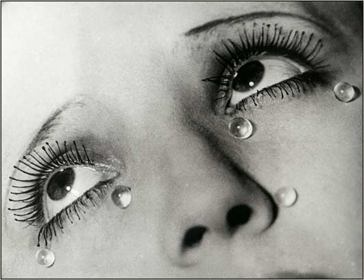

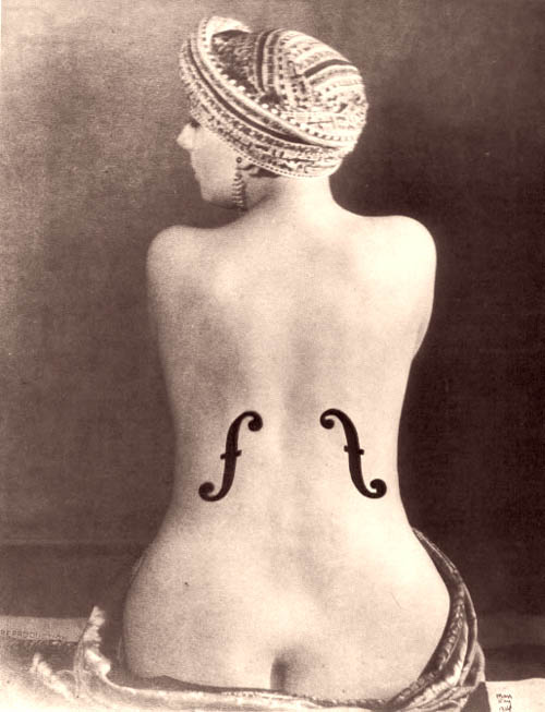
Man Ray (actually Emmanuel Radnitzky) was a modernist artist and had a strong influence on the Dada and Surrealist movements. Originally educated as a painter, Ray is known best for his unconventional (then, VERY unconventional) photography. His transition to photography was an unusual progression, as most artists leave the “more rigid” art of photography in search of the broader range of expression that is thought to be thought of in painting, drawing, sculpture etc. On the contrary, in his own words:
“I began as a painter. In photographing my canvases I discovered the value of reproduction in black and white. The day came when I destroyed the painting and kept the reproduction. From then on I never stopped believing that painting is an obsolete form of expression and that photography will dethrone it when the public is visually educated. I know one thing for sure - I need to experiment one form or another. Photography gives me the means, a simpler and faster means than painting.”
Producing the bulk of his best-known work in the 20s and 30s, man ray’s use of alternative printing techniques was then unheard of. Perhaps most importantly, he managed to pull it off in such an elegant and beautiful way that it caught the public’s eye, and helped propel the Surrealist and Dada movements into the next decade.
I love Man Ray so much. He manages to create painterly, surreal, dreamlike photographs, not unlike one of my other favorite photographers, Jerry Uelsmann. As a fellow painter/photographer, this influences me to blend me interests and allow my work to flow through different mediums.
I would compare Ray’s work as a photographer to Roger Ballen’s photographs, both relying on strong juxtapositions and eerie feelings that something is just not right.
Jan Von Holleben


 Oh how I adore these photos! Jan Von Holleben’s creative Dreams of Flying series are full of childhood innocence and charm. Jan utilizes the influences of his cinematographer and child therapist parents on this project. His work explores the visual representation of childhood and what it really means to be a kid. The background, which is really the floor, is set up so as to present a storyboard aesthetics. The kids are really just lying on their side. Perhaps it is easy to figure it out but it becomes irrelevant how his images are made because the photographs themselves are beautiful and fun. I included this photographer because I have plans of photographing childhood as well and I really miss photography that is fun...
Roger Ballen


 I’m including an artist that I do not understand because how he talks about his work is intriguing. Ballen, who was born in New York but got involved in the mining industry in Johannesburg, South Africa where he found himself documenting the workers. In the mid 90s, he became a photographer of fictions. The series that peaked my interest was Shadow Chamber; it focuses on the interaction between the people, animals, and/or objects in the somewhat apprehensive space. His photographs have been noted as being painterly and sculptural. Which is one of the reasons why I felt a need to understand his work.
Ballen has often related his process of working to mining (he was a mining consultant), an ore car coming and going from a black hole, traveling back and forth from some place called the unconscious mind to some place called the conscious mind. He is often meticulous with the physical set up of the scene but yet gave total freedom of his models. I am including him as one of my artists because his work art baffles me. It seems deeply personal and for me to interpret it, it is like trying to interpret this man’s own memories.
Hughie O'Donoghue


I've recently come across this artist, Hughie O'donoghue. He works with a variety of media, the pieces shown are Carborundum, an etching, and an oil painting, respectively. I find Hugie's work very similar to mind in the sense that he really plays with the human figure and what he can show to allow a viewer to still recognize it as a figure.
I think that O'Donoghue's work is can be compared with Robb johnson's photography. His work, like Hughie's gives the viewer a glimpse, sometimes even less, of an image, leaving us to ponder what we are looking at.
Walter marton and Paloma Munoz


 Walter Martin and Paloma Munoz depict uneasy scenarios with their photographs of snow globes. My initial impression of Martin and Munoz’s work was that of fancifulness. However, it quickly darkens and I found myself feeling anxious. What I love about the Travelers series is its ability to uproot your sense of place and reality to offer you another possibility. The construction of each globe is so minimal yet each clearly contains a suspenseful story of travelers experiencing a moment of homelessness. It pricks at our fear of loosing the security that a house or home symbolizes. The artist’s decision to show the curved limits of the globes allows the work to acknowledge its own fantastical nature, yet it did not diminish the ambiance and feeling each scenario conjures up in the viewer. I was made fully aware of being a voyeur and at times being helpless. I am attracted to Travelers ability to draw the viewer into its frames and in essence transcend its two dimensionality.
In a way, Martin and Munoz’s work reminds me of Robert and Shana Parkeharrison’s collaboration, specifically images that encapsulate a dreamscape. Personally, I gravitate a little more to Travelers because of its refreshing aesthetics and dark humor.
jenny Saville


my artist of the week is Jenny Saville. Her painterly style has been compared to that of Lucien Freud and Rubens. Her paintings are usually much larger than life size. They are strongly pigmented and give a highly sensual impression of the surface of the skin as well as the mass of the body. Since her debut in 1992, her focus has remained on the body. Her published sketches and documents include surgical photographs of liposuction, trauma victims, deformity correction, disease states and transgender patients. I really admire the brushwork in her paintings, not to mention the color and the style.
I think Jenny's work is very similar to Shawn Barber's paintings, his tattoo series. I see very similar painterly qualities in some of the brushwork and style in theses paintings.
Subscribe to:
Posts (Atom)