Tuesday, October 30, 2007

Thomas Kinkaide (Michael's Pick)


I've been making jokes about using Thomas Kinkaide (The Painter of Light, tm) seriously for a few weeks now. The more I make them, the more I realize that half the time we makes jokes in life, its because we want to gauge other's responses.

So why not consider Thomas Kinkaide seriously? He's the best selling artist of our time. Formally and aesthetically, his artwork is beautiful and pleasant. Ask any grandmother. Can beauty be its own reward, or is that a bygone of the era of art as image?

My interest in Thomas Kinkaide comes mainly from the fact that he makes no bones about marketing his artwork in ridiculous ways. Go to Barnes and Noble, for example. You can get the Thomas Kinkaide 2008 Engagement Calendar, Thank You cards, and he even has a series of novels that he "co-wrote" in the Religious Fiction section. While we may consider the pandering of his aesthetic to a targeted niche (the tasteless), he really is playing the market in a rather saavy way. Has he compromised his ideals? Does he share OUR ideals as artists? Does he derive joy from his painting, from making marks on the printed canvases he sells at his mall "gallerys"? Don't artists historically panderer to the rich and clueless?

Living in this post mechanical reproduction, post image world, an artist like Kinkaide (whether knowingly or not) is demonstrating a lot of very important issues in the art world and asking a lot about the role of the artist and the modes of representation. Obviously though, his lack of importance in the art world comes from the fact that he contributes nothing to our culture. Its all more of the same, and it looks tacky on my walls, even though the print was cheap at the Christmas Tree Shop.

But I cant help but be a little envious. He is doing something he loves, has reconciled the fact that he's pandering to bad sensibilities (check out his website. He's doing paintings for Disney of Cinderella's Castle!!!), and is making a mint off it. I can fault him all I want, but he's still rich as hell. Artistic integrity or Grandma's Money?

You decide.

Saturday, October 27, 2007

Andrew Emond (Cade's Post)


Andrew Emond is a photographer from Canada who maintains a blog detailing his photographic finds while exploring urban and industrial desolation. He has everything from the interiors of the offices of abandoned mines to empty sewer channels deep under the ground. It seems that his wanderings are endless and varied, and he is mainly interested in the lack of human presence but also the human footprint, which is something that draws me to urban night photography as well. His photographs are interesting to think about in the context of modern society, for many of them deal with things like asbestos mines. He explores so thoroughly that in many of his photographs he provides some of the history he has discovered about a place. For instance, sometimes there will be photos of binders on empty desks, and they will only say "1995" on them. I find his work very interesting because his photos speak to his awareness of his own presence in a location (he occasionally puts himself in the shot also), and also his interest in the fact that in some of these places, the people just got up and left one day and never came back.

Thursday, October 25, 2007

dion archibald (jenn's pick)

t: traffic d: 2002 m: oil on board s: 60x90cm $: private collection

Dion Archibald is a young painter from Australia. His main focus is experimenting with materials and technique in order to portray his subject matter. He works in both figurative painting and Urban landscapes. This relates to my work because one of my favorite things to paint is urban landscapes. I like the way he uses thin layers of paint and overlaps them. I also like the way he has no outlines for some of his layers, like the mountains, and then has thick black lines going across the canvas in order to create depth in the picture. His color palette is also similar to mine for both the urban landscape, and the portrait. I appreciate shades of gray, and sometimes using a bold color in order to create contrast.
His expressionist way of painting, and creating his figures with a certain mood is similar to Peter's pick, Connor Harrington. Although Archibald's is more painterly, they both use layers in order to portray the form.

Robb Johnson (Whitney's Post)


My artist of the week is Robb Johnson. I chose him because his work is somewhat related to mine in that his images expose the physicality of photography by making the grain very apparent, but he isn't currently working in digital, so I don't know to what extent the images are manipulated. He also works with shadows and other ways of creating layers in his images, something I've been working towards myself.

Robb Johnson's photos compliment Marcus Harvey's paintings nicely. Both artists' images expose the materiality of their chosen medium and both work with abstracted, layered images.

Connor Harrington (peter's pick)

'According to Conor himself, central to his oil canvasses is "the male figure, referring to the masculinity of urban culture". The men in Conor's paintings allude to the not necessarily heroic, but stoic and pensive male of the modernist painters; however the pieces are plastered with post-modern graffito flourishes in a pertinent clash of styles - "I'm interested in the dynamics between opposing elements" says the artist. Both the male figures and abstract elements of the work are unarguably contemporary, the emotions they transmit are timeless, if currently under-rated - dignity, courage and a quiet sense of duty to oneself and those around us.'
I see harrington's work as very similar to mine, in the sense of dealing with the human figure while maintaining a sense of an abstract element.

I really like Stephen Gill's photos (Whitney's pick). I think they have a painterly quality to them, with the colors especially. I think the top photo also contains some abstract elements in it.

Wednesday, October 24, 2007

Marina Bychkova (Nicole's Pick)


Marina Bychkova is a Russian born artist now living and working in Canada. She focuses primarily on doll making but also dabbles in painting and intaglio prints. She began creating her dolls when she was six years old and is intrigued by the idea of escapism that they create. She creates narratives of fairy tales and states that, “What intrigues me about a fairy tale is the implicit and often explicit violence that lies just beneath the surface of the magic”.

I am drawn to her work because she is able to portray a great deal of narrative through her dolls and the images of her dolls. She is also interested in the idea of what goes on beneath just the surface and pushing her work to convey those ideas.

I suppose Bychkova could be compared to Yann Arthus-Bertrand in that the both use the idea of delicacy and softness when creating art. They are both concerned with letting the images speak for themselves as opposed to trying to send a literal message.

I really like the Marc Abrahms post. After looking through some of his images, I have found that I like his "People" series. They show and immense amount of character and expression.

Thursday, October 18, 2007

Marcus Harvey (Mike Seidman's pick)


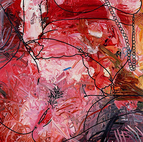
My pick this week is Marcus Harvey who Greg introduced me to a few days ago via the email tubes. In this series he’s doing, he layers an abstract ground with very hard-edged graphic/illustrative images (mostly pornographic). He uses a the full spectrum of colors and a combination of random and clearly premeditated directionality in the brushwork, which is at points related to, but not perfectly aligned with the content that is outlined on top. They eye darts around the square compositions and tries to relate it to the outlined subject. I find myself allowing the coloration to act as shading and depth and form, yet it is dynamic and upon close inspection, this effect breaks down. The viewer is free to jump in and out of seeing a complete and incomplete image. I really like this series and it inspires me to continue struggling with my project/s, and to find an uncontrived elegant way of dealing with all this in one decisive… thing. It also inspires me to broaden my scope to a wealth of diverse techniques and colors and styles that can all create the same effect. I need to use more color and go back to oil. Also, obscene is always a plus. Yes always.

Now for the artificial business of connecting some aspect of this work to some aspect of another posted work. You could really choose any two at random and draw some connection. I suppose it’s a good exercise in building an eagerness to make connections in the art world. I will connect Marcus Harvey to Morton Bartlett (Nicole’s pick). Both artists straddle the impression of realism and familiarity. Bartlett deals with family and tries to concoct realistic family photos with dolls, while Harvey evokes this tremendous institution of pornography and so they both deal with a whole genre of something that we have expectations for. Yet they both tweak the presentation in a way that it becomes something new. Something familiar and unfamiliar by the same token.

I like Andy Goldsworthy (Michael’s pick). A lot. I love the act of creating something that appears artificial from that which is exclusively “natural.” I love the act of creating something that looks natural that, upon closer inspection, cannot possibly be naturally occurring. I like the transience of his sculptures and the fact that they rapidly deteriorate. Yet he photographs them, so we know that he is not simply at peace with allowing his works to dissapear. He documents them and stores them and guards them. Goldsworthy’s less-than-Zen personality is a remarkable compliment to his reeking-of-Zen productions. That makes his whole career even more interesting.

Marc Abrahms

I discovered photographer Marc Abrahms after my family received his book Watercolors from him. Recently, I have been looking at his other series of prints online. There is no underlying meaning or message in his photographs. Instead, I believe that Abrahms tries to capture images that are aesthetically pleasing. I think that he is very successful at documenting beautiful moments around the world. I am intrigued by his work because of the vivid colors that he catches in his photographs. His series on vegetables and fruit is one of my favorites because of the intense colors found in the food and his ability to illustrate the texture of the vegetables. Additionally I am interested in his grappa bottle photographs because reflections of the surrounding area are found on the bottles.

Abrahms work relates the most to Andy Goldsworthy piece since both artists focus on capturing impermanent objects. For example, in Abrahms’ shot at the market place, the fruits will go bad, change color or get purchased just like leaves piece from Goldsworthy’s will change with time and weather. Both artists use strong colors in the works.

I also liked Phil Borges work. The concept that he is documenting in his photographs is extremely interesting and thought provoking. By placing the people of one generation next to their younger counterpart it helps communicate the lack of disconnect with one cultures that occurs over time in this era of globalization.

Tuesday, October 16, 2007

Phil Borges (Michael's Pick)


My pick for this week is Phil Borges. Borges is a photographer who deals with the rapidly diminishing number of native tongues and populations in a world that is rapidly globalizing. The work pictured here shows two sides of his work and two sides of the world. He is just as concerned with the aging remnants of a culture as he is with the children growing up, not knowing the language or culture. His work is tied to the Bridges Project, which aims to preserve the rapidly dissolving cultures in our world. Specifically, he is photographing peoples with animist religions tied to the natural world.

The images themselves are desaturated digital photographs showing indigenous peoples in their God given land and in their current complex social surroundings. Figures are meant to "pop" out from the background, and with a striking result. The descriptions of his work are often compassionate narratives on the plight of the individuals in each image. They are not about the image as image. They are the image as reactant. As mover and shaker.

What I like most about his work is that 1) his interest is more sincere than Edward Curtis and 2) that his artwork is tied to a social theme and organization. In the past few weeks, I've been thinking hard about the roll of the artist in the world after the death of the image. Creating images that tie into and further social action and social betterment could be one of the roles of the artist in this age.

Discuss.

Thursday, October 11, 2007

Amy Cutler

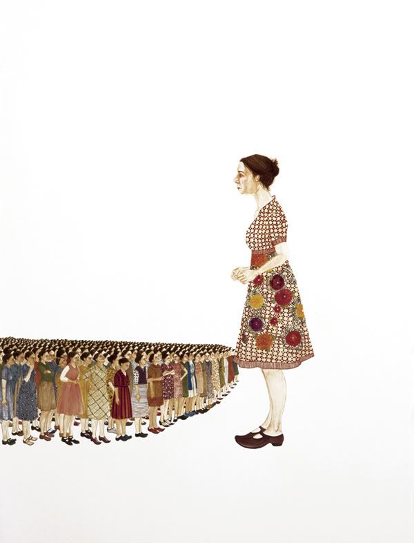
Army of Me, 2003

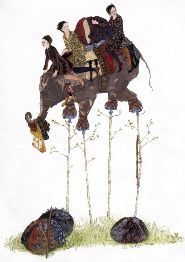
Passage, 2005


Amy Cutler is an artist who works primarily in gouache. She paints images of women in odd, surreal situations. Although they are paintings, and on a large scale, her work has an illustration aesthetic, especially due to her linear style. The paintings are interesting because although they are easily readable for content, they are less easy to read for meaning. It's easy to see that she's painting several women riding on an elephant, but less easy to tell what she intends to say. Rather than a direct message behind her works, they seem to lave looser ties in the idea of whimsy and narrative.

Cutler's work appeals to me because of the crisp feel that her style conveys, and her use of white negative space. Somehow she manages to create a sense of there being more going on in the space than we can see, although it doesn't feel that there is an obstruction or something missing in our view.

I think that her work most relates to Masha D'Yans, because of the illustration aspect.

Stephen Gill (Whitney's Pick)


This week I chose the photographer Stephen Gill. I originally chose him because of his series "Buried," (second image) which is a collection of images he shot, buried, and dug up. I find this concept very interesting because it introduces the element of time and a sense of unpredictability, of letting go of the finished product. Gill's other work is also very appealing - I enjoy his very straightforward documentary style and the color in his work, because it has an older, almost vintage feel.

Gill's series "Hackney Flowers" (first image) reminds of Andy Goldsworthy's work, because Gill used actual natural objects in addition to photographing them. While Goldsworthy uses natural objects as the building blocks of his work, Gill's use of natural objects is somewhat more literal - the flowers and plants he uses represent themselves in the images, while Goldsworthy uses the objects to build pieces that may not be directly related to the individual objects.

Morton Bartlett (Nicole's Pick)


Morton Bartlett is a photographer originally born in Chicago and then adopted by a family in Boston. He was enchanted with the idea of creating a family and thus created his own. He constructed and created small anatomically correct children out of plaster and then dressed them in handmade clothes and handmade wigs. He would posed the children in a setting and photograph them, sometimes clothed and sometimes naked. He would photograph them in primarily black and white. Morton Bartlett interests me because he created this whole family for himself. He builds such intricate dolls and creates photographs that make you do a double take, wondering if the dolls are really small children or not.

Morton Bartlett relates to Shawn Barber’s Doll series. Barber tries to create a sense of realism as does Bartlett. Barber also focuses a lot on the detail of each doll which Bartlett captures in his photo.

I also liked Whitney’s pick, of Mandy Lamb. The images are soft and delicate and the Polaroid camera adds a sort of whimsical feel.

Oriol Nicolas- Lauren's Pick

Oriol Nicolas is an illustrator from Barcelona. A lot of the work in his portfolio combines text and image (however i find the ones without text to be better). In, "Dad" (acrylic on canvas) it is Nicolas's attention to subtle detail that makes it successful. The wind blown side of the man's jacket is the only real suggestion of movement. In contrast with the watery, loose brushstrokes in the background and his careful use of shadow, the styalized figure becomes lifelike.

What impresses me most about "the red ones" is the consistant accurracy of the subjects' anatomy. Even though the two men are being shown at an awkward perspective and have no background to orient the viewer, their figures appear in perfect proportion. Using white line to make shadows on orange clothing, their stances are both clearly pronounced. Nicolas uses only 3 colors of acrylic paint per piece. In this case, simplicity and understanding of design principles create the most effective work.

Wednesday, October 3, 2007

Fulvio Bortolozzo (Cade's Post)

16 agosto 2005/2

20 marzo 2005/3

Fulvio Bortolozzo's series "Olimpia" is a nocturnal documentation of Turin, Italy, and some of the preparations there for the 2006 Winter Olympics. According to his website, this series is also part of a larger, broader series. These night photos are interesting because they show a city in the midst of a large transformation and the physical preparations for a huge international event, but since it is night, the equipment is deserted and there is little evidence of human presence. Bortolozzo does not use low-key lighting by any means, giving the landscape a sort of bizarre radiance regardless of its emptiness. The other photos in the series show a place that is lit as if it was meant for human presence and activity throughout the entire night but that stands deserted and still. I like this series because there is an obvious consistency between the photos without too much repetition. While every photo is at night in the same city, Bortolozzo shows construction sites, apartment buildings, both empty streets and streets with car lights streaking by, and interesting angles on the spaces he sees. One thing about night photography is that the camera almost always sees night extremely differently than the eye; Bortolozzo's photos are good evidence for this.

Tuesday, October 2, 2007

"Just Britney" art show (Jenn)

JAMIE BOLING Snake Charmer oil on canvas


This is an art show that includes many different artists portraying Britney Spears, and is going on in Hollywood right now. My friend knew that I've been focusing on Hollywood girls for my project, and she sent this to me. The first work I'm posting is a great croch-shot of Britney, in the car with Paris Hilton. The second work is many Chris Crocker ("LEAVE BRITNEY ALONE" - look it up on youtube if you haven't seen it) images put together to create an image of Britney's face.
I found this show helpful because I was thinking about different media I could use in addition to painting. The artistic techniques in this show are very diverse, and they also show Britney from many points of view. Some of the works aren't necessarily negative, but more a critical view.
I feel like I might have cheated by picking an entire show, but I couldn't pick just one of these artists for my artist of the week.
The show has a myspace: http://www.myspace.com/just_britneyartshow
I think these can relate to the portraits that Shawn Barber did, especially the Jamie Boling work demonstrates realism, and expression in the work.